In March of 2020, one of our Digital Media Alumni had an illustration and poster design published on Star Wars’ Instagram for The Mandalorian series during the recent Disney+ debut in the UK. We asked her a few questions.
How did you get this opportunity to work on a poster for The Mandalorian?
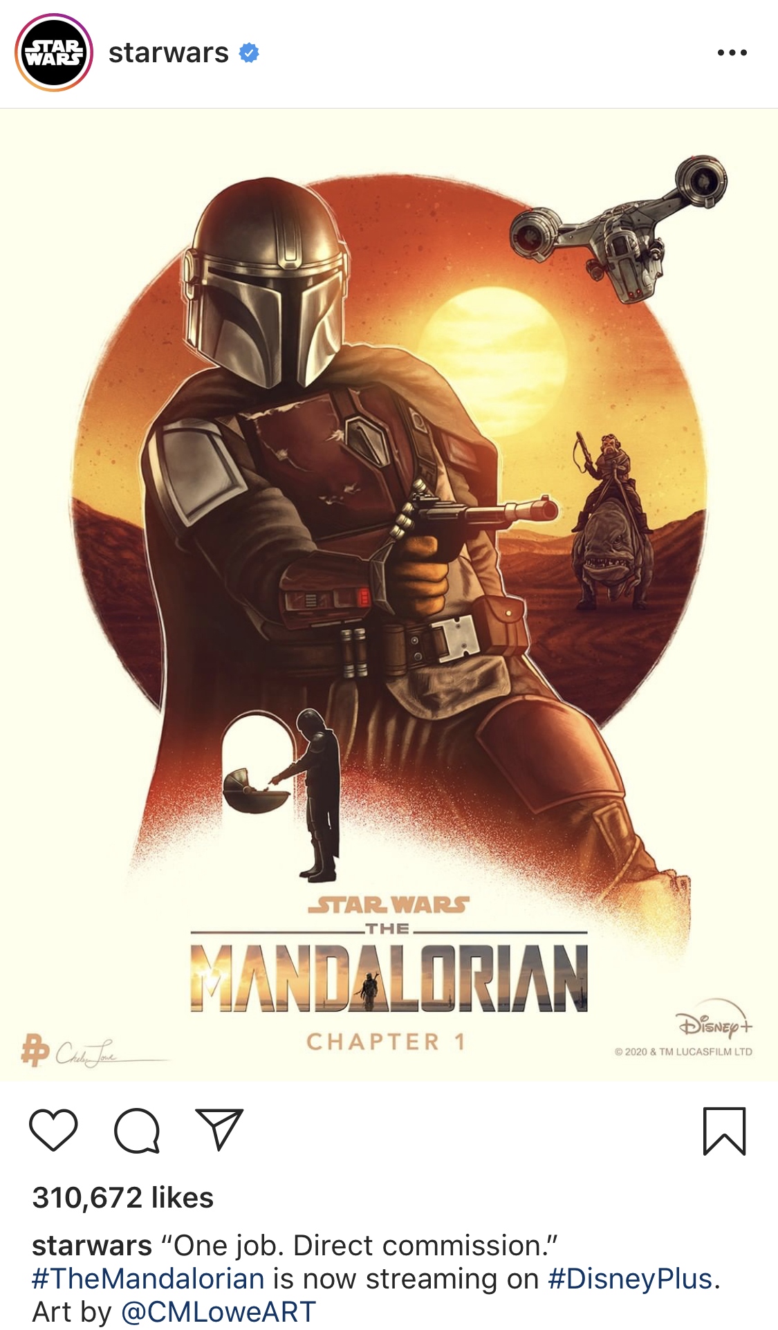
A little over a year ago I was invited to join an agency called the Poster Posse. They have about 50 or so artists on their roster. One of the main types of projects we do are these digital and social media campaigns where a group of us is selected and commissioned to create official illustrated posters for various movies and tv series coming out. The studio then publishes the posters online – mostly to official Twitter, Facebook, and Instagram accounts connected with the project. Overall they get a very positive response from followers and it helps people get excited for the release of that movie or show. For The Mandalorian, this one was posted to the official social media accounts for Star Wars and The Mandalorian.
For The Mandalorian, this is the second wave of posters in the process of being released. Back in the fall, other artists in the Poster Posse created a series of posters that were released around the time Disney+ debuted in the US. Since Disney+ just debuted in the UK recently, they’re now releasing this new group of posters focusing on individual episodes. For the artists involved, we were each assigned an episode to focus on – and they gave me the first one. I suspect that everyone else’s posters will be released weekly as the episodes release to Disney+ in the UK.
What was it like getting art direction from Disney and Lucasfilm?
For the most part, artists have most of the control for the campaigns we do (although I’m sure it’d be way different if we were doing the actual theatrical posters). They do give us a creative brief though. For this one in particular, the studio wanted the posters to be a representation of individual episodes instead of the series as a whole. And they were a little stricter with the logos. Usually we have more creative freedom with how to represent the title treatment but for The Mandalorian they wanted everyone to use the same one, with their respective episode title underneath the logo – so that everyone’s posters will look more unified that way.
We’re mostly working with the digital marketing teams for the studios. This one was pretty similar to other poster campaigns I’ve worked on for Disney. I first create and submit a group of concept sketches for the poster. Sometimes I create 3 or 4, but for The Mandalorian I submitted closer to 10 concepts. From those concepts the digital marketing team selected which one was their favorite and I then proceeded with creating the final art.
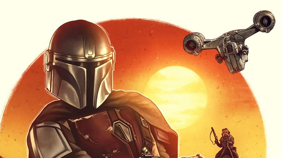
What was your inspiration for the style of the illustration and the poster design?
The Mandalorian has a very spaghetti western vibe (which I absolutely LOVE) so I was heavily inspired by a lot of the imagery I see in posters from that genre. Especially when it comes to portraying the gun-slinging hero in front of a sunset. During the concept stage, I originally had the background scenery completely visible – so no circle design. I was working with different variations of the layout, and I wanted to try and get it closer to that spaghetti western look. I noticed a lot of those posters portray the colorful scenery against a white or light background. I use circles a lot in my work anyway with suns and moons, so I decided to use it as a way to help with cropping and displaying the art against a light background. I think it also helps with isolating Mando and putting him in the forefront as the hero.
Overall this was such a fantastic project to work on – I was beyond excited when I received the initial email inviting me to do it. It’s such a great series, and creating something official for the Star Wars franchise was definitely a bucket list item. Keeping my fingers crossed that I can do it again for season 2!
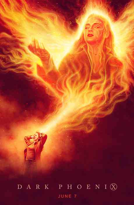
Here’s more poster work from Chelsea